Admission

Admission

Admission is an annual collectible publication documenting the people, places, stories, and moments shaping music culture. I developed a visual identity designed to feel expressive and ever-changing while maintaining a recognizable editorial foundation.

Admission is an annual collectible publication documenting the people, places, stories, and moments shaping music culture. I developed a visual identity designed to feel expressive and ever-changing while maintaining a recognizable editorial foundation.

Project Type

Logo Identity

Logo Identity

Year

2026

2026

Role

Brand Identity / Logo Design / Art Direction

Brand Identity / Logo Design / Art Direction

partnership materials

Admission’s visual language adapts to imagery while maintaining a recognizable editorial presence.

campaign system

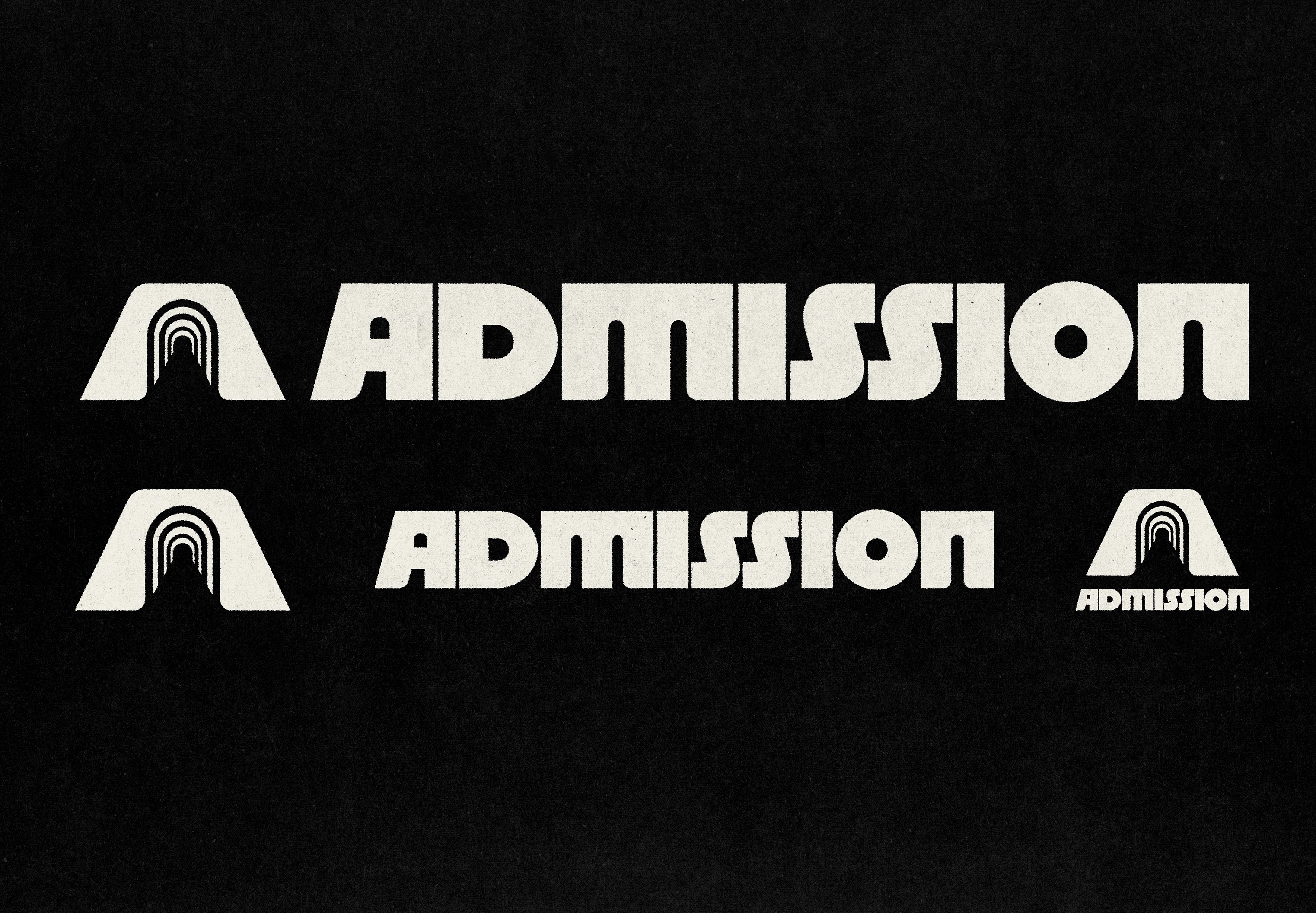
The Admission identity is built as a flexible logo system, allowing the mark to adapt across editorial, digital, and physical applications while maintaining a consistent visual presence.

visual direction

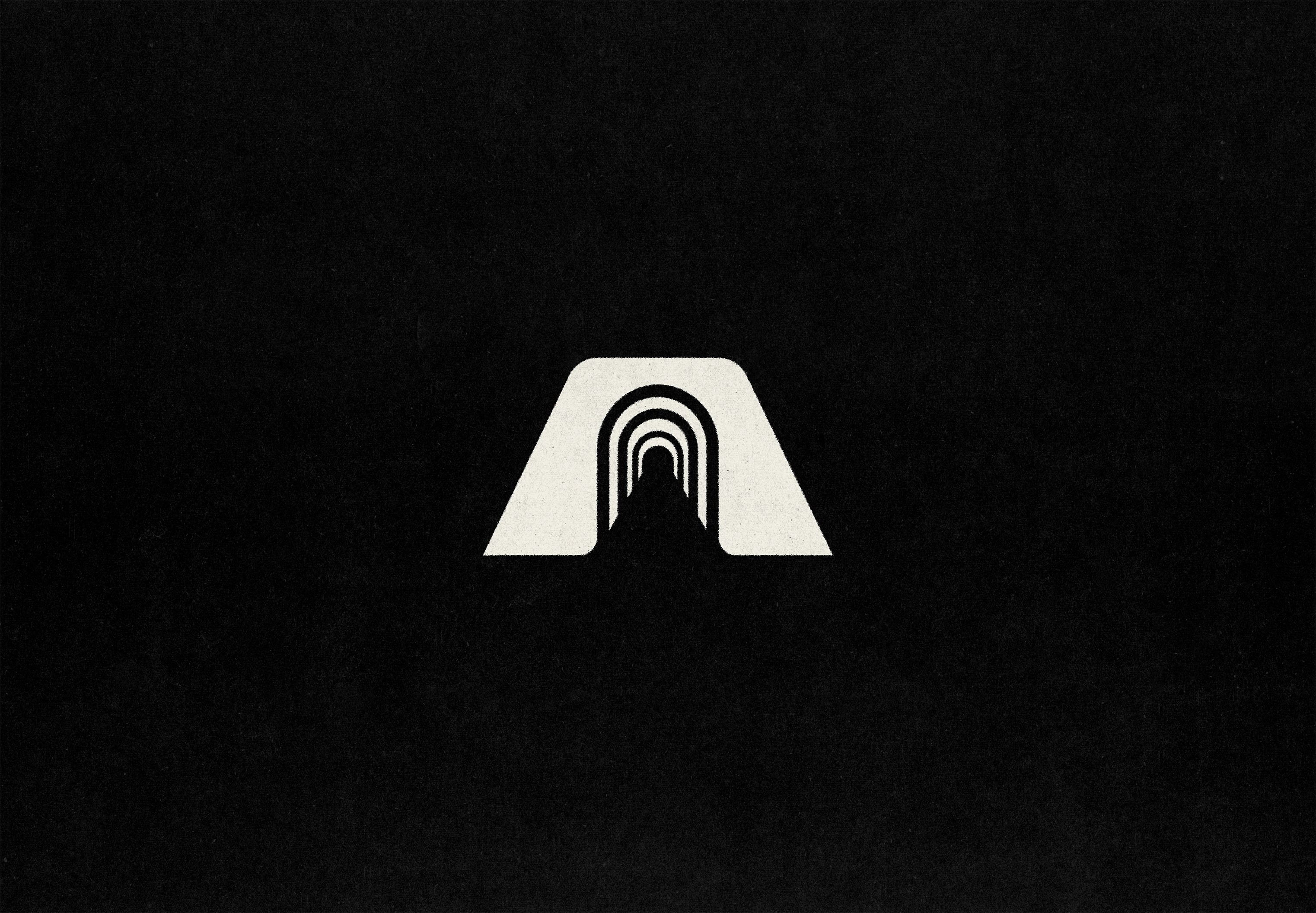
Built around the idea of access, the Admission icon creates a visual entry point into music culture. Layered forms introduce depth and movement, creating a mark designed to remain distinct across an ever-changing cultural landscape.
    event touchpoints

    A flexible typographic and color system gives Admission the ability to shift in tone while maintaining a consistent visual language. Field Gothic provides a unified voice across editorial and cultural applications, while the high-impact palette introduces energy and variation.

    the live event

    Admission extends into apparel as a wearable expression of the identity, bringing the brand’s bold visual language into a more lived-in, cultural context.

    The Identity Idea

    The Identity Idea

    Built around the idea of access, the Admission icon creates a visual entry point into music culture. Layered forms introduce depth and movement, creating a mark designed to remain distinct across an ever-changing cultural landscape.

    Logo System

    Logo System

    The Admission identity is built as a flexible logo system, allowing the mark to adapt across editorial, digital, and physical applications while maintaining a consistent visual presence.

    System in Use

    System in Use

    A flexible typographic and color system gives Admission the ability to shift in tone while maintaining a consistent visual language. Field Gothic provides a unified voice across editorial and cultural applications, while the high-impact palette introduces energy and variation.

    Brand in Use

    Brand in Use

    Admission extends into apparel as a wearable expression of the identity, bringing the brand’s bold visual language into a more lived-in, cultural context.

    Identity in Culture

    Identity in Culture

    Admission’s visual language adapts to imagery while maintaining a recognizable editorial presence.

    visual direction

    Built around the idea of access, the Admission icon creates a visual entry point into music culture. Layered forms introduce depth and movement, creating a mark designed to remain distinct across an ever-changing cultural landscape.

    Built around the idea of access, the Admission icon creates a visual entry point into music culture. Layered forms introduce depth and movement, creating a mark designed to remain distinct across an ever-changing cultural landscape.

    campaign system

    The primary campaign assets introduced the full week of programming while giving key headliners their own promotional moments. The system needed to hold a lot of event information without losing the energy, hierarchy, or visual impact expected from a major Miami Music Week lineup.

    The Admission identity is built as a flexible logo system, allowing the mark to adapt across editorial, digital, and physical applications while maintaining a consistent visual presence.

    the live event

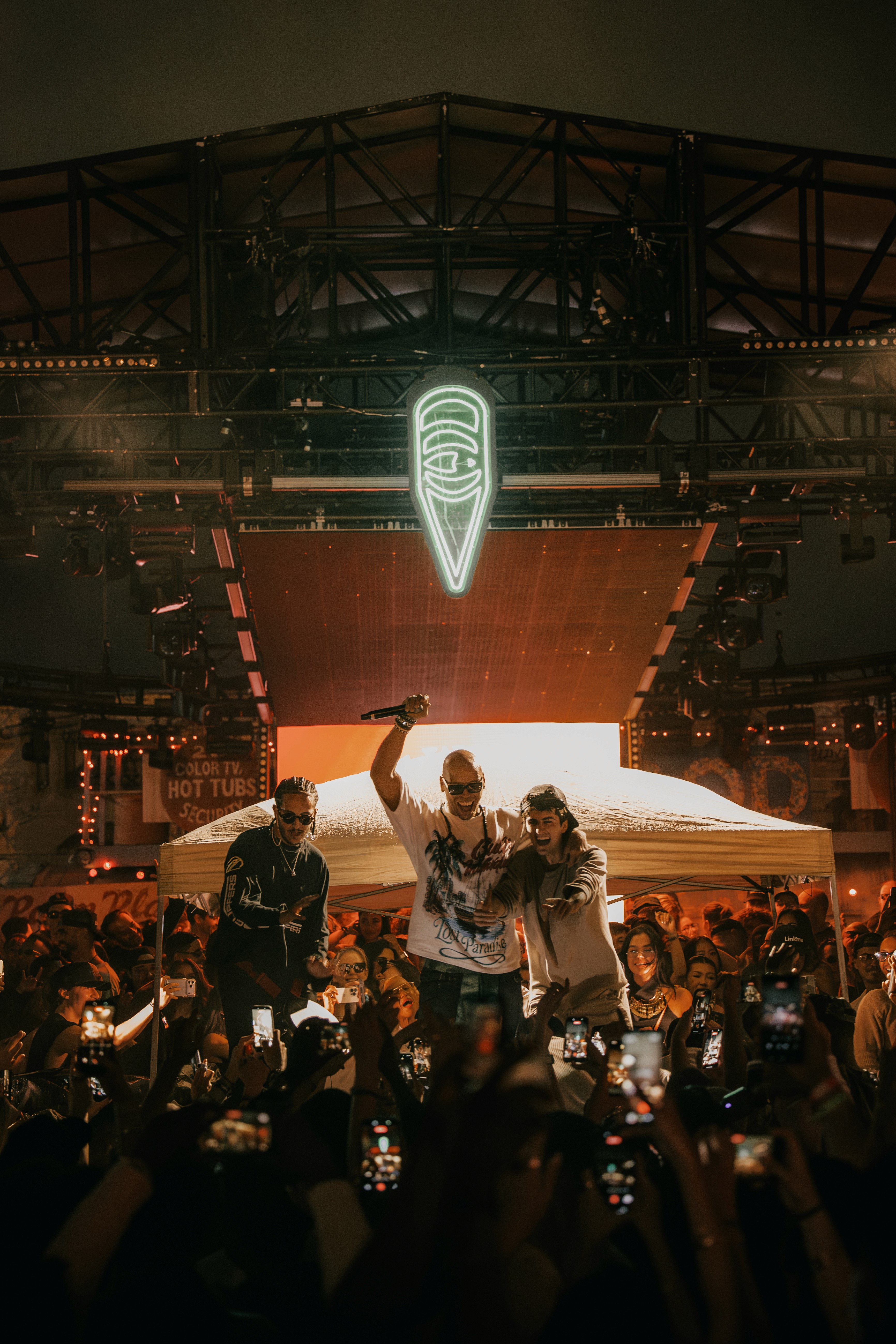
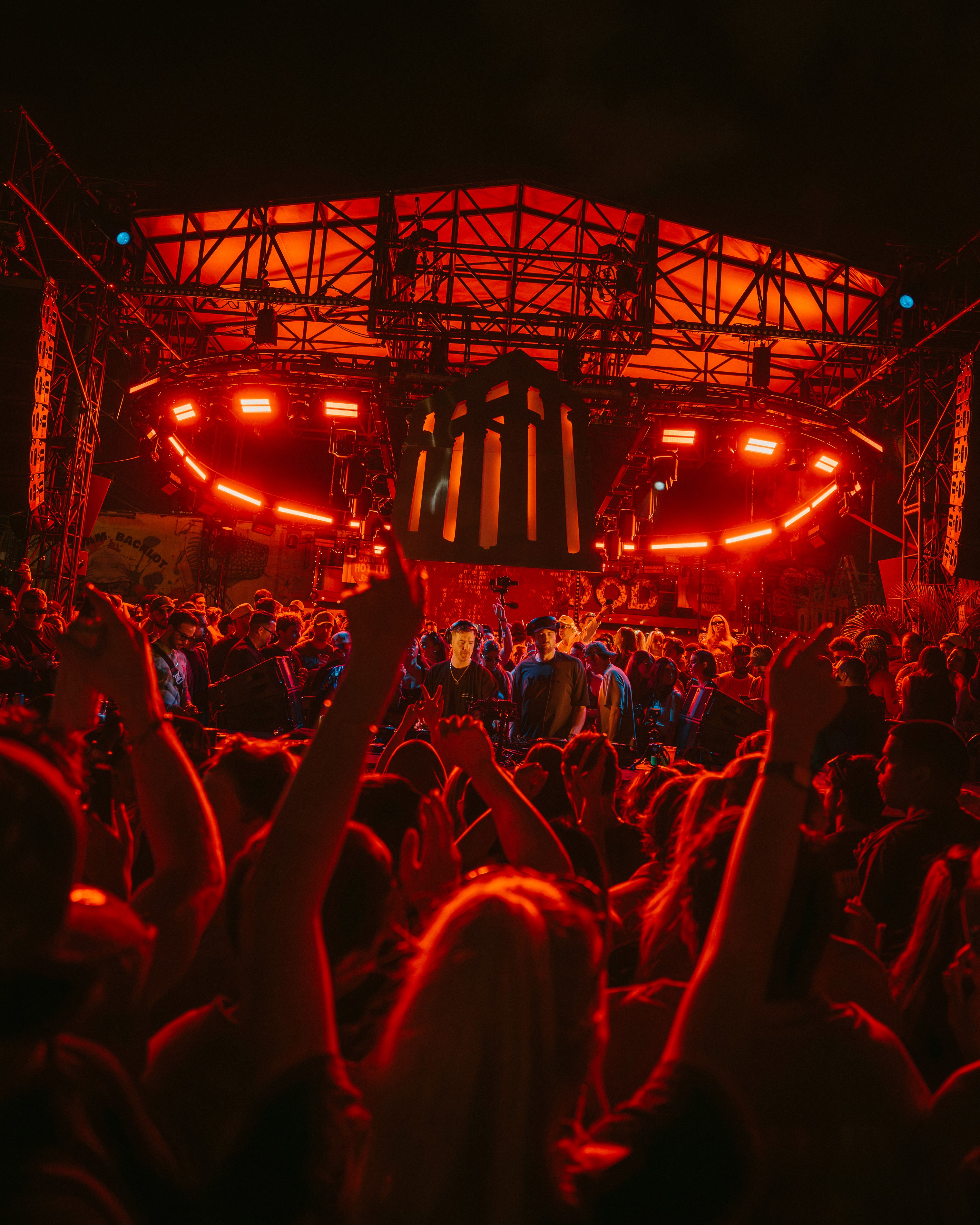
    The final campaign lived across both digital promotion and the on-site experience, supporting a week of programming during one of the busiest moments in electronic music. Event photography helped capture the scale, atmosphere, and real-world energy the system was built to support.

    Admission extends into apparel as a wearable expression of the identity, bringing the brand’s bold visual language into a more lived-in, cultural context.

    event touchpoints

    The system extended into physical event materials, including wristbands and credentials for staff, artists, and guests. Each piece needed to feel connected to the campaign while still being functional, scannable, and easy to differentiate across event days and access levels.

    A flexible typographic and color system gives Admission the ability to shift in tone while maintaining a consistent visual language. Field Gothic provides a unified voice across editorial and cultural applications, while the high-impact palette introduces energy and variation.

    partnership materials

    The campaign language was adapted into sponsorship materials, balancing the energy of the event with a more polished presentation format for brand partners. The deck needed to feel visually connected to the campaign while still supporting clear storytelling, audience insights, and partnership value.

    Admission’s visual language adapts to imagery while maintaining a recognizable editorial presence.

    MORE

    MORE

    © 1998

    file678.studios@gmail.com

    © 1998

    file678.studios@gmail.com

    © 1998

    file678.studios@gmail.com