Miami Music Week 2026
Miami Music Week 2026
For Miami Music Week 2026, I led the visual design for Phase 3 Presents’ event campaign, building a flexible system across promotional, physical, and guest-facing touchpoints. The direction was built around bringing a distinct Miami energy into the campaign through color, layered typography, and a downtown map-based graphic language. The result was a polished, high-energy system that felt connected to the city without relying on obvious Miami clichés.
For Miami Music Week 2026, I led the visual design for Phase 3 Presents’ event campaign, building a flexible system across promotional, physical, and guest-facing touchpoints. The direction was built around bringing a distinct Miami energy into the campaign through color, layered typography, and a downtown map-based graphic language. The result was a polished, high-energy system that felt connected to the city without relying on obvious Miami clichés.
Project Type
Campaign Identity
Campaign Identity
Year
2026
2026
Role
Lead Visual Designer
Lead Visual Designer


partnership materials
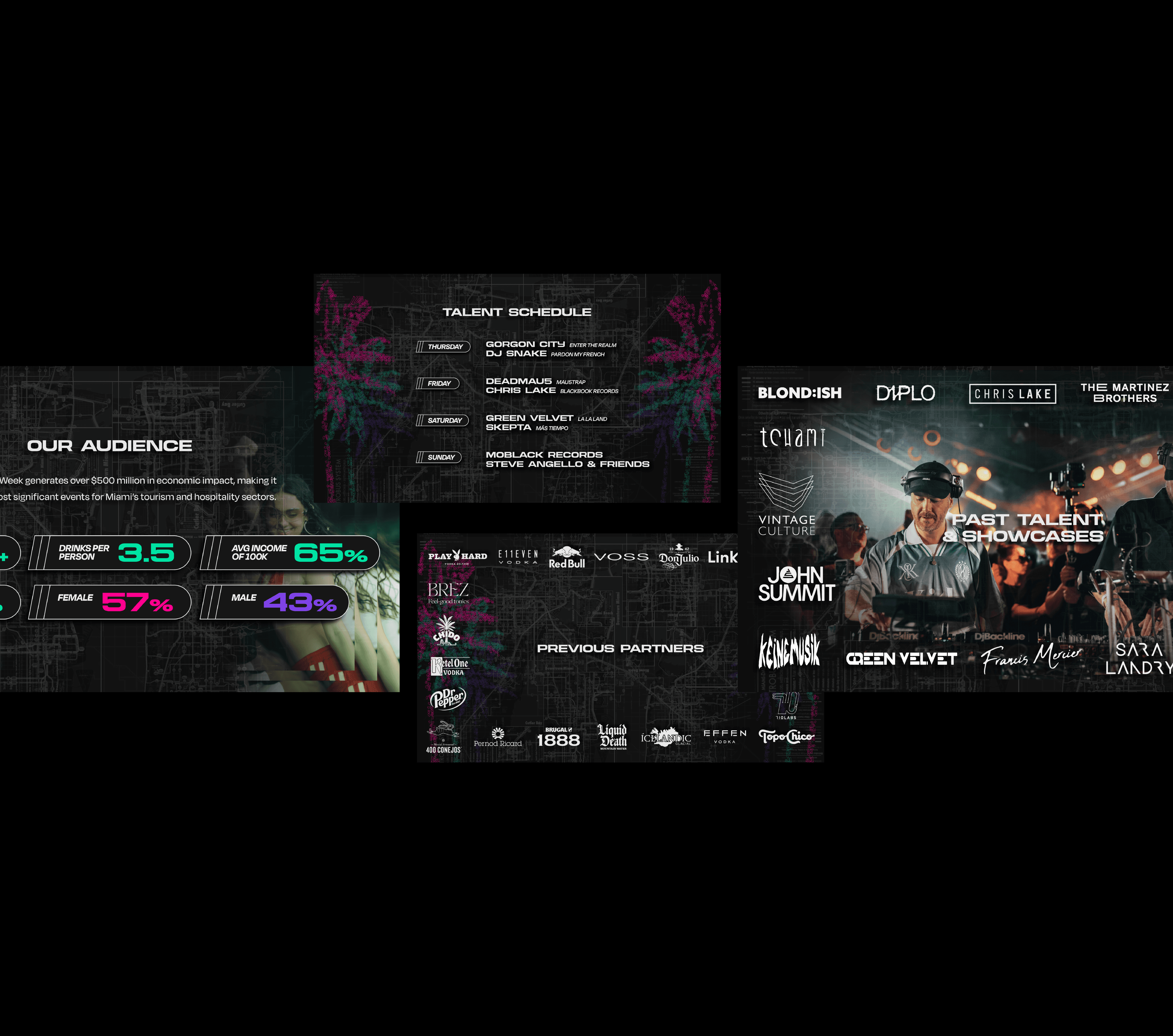
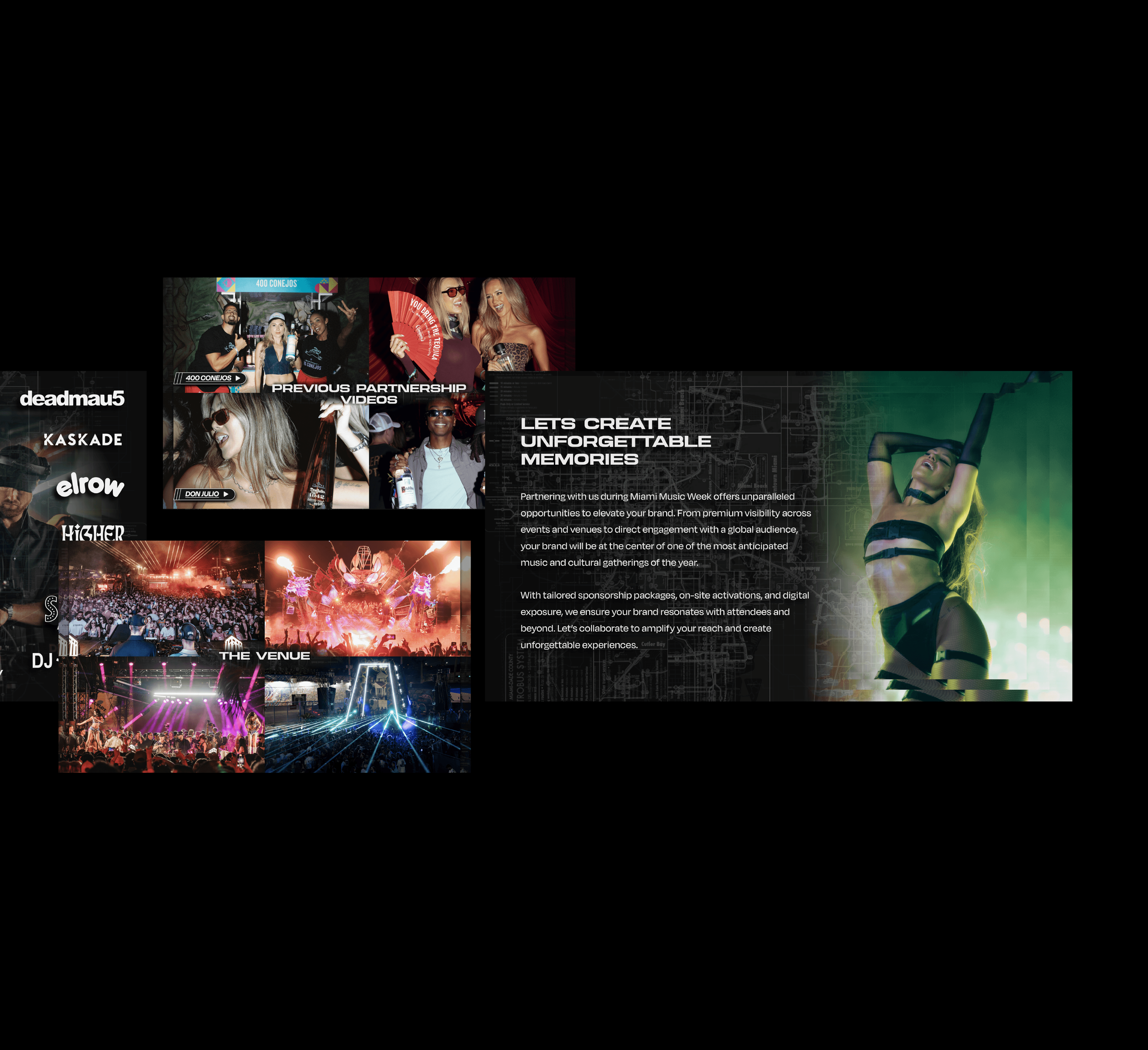
The campaign language was adapted into sponsorship materials, balancing the energy of the event with a more polished presentation format for brand partners. The deck needed to feel visually connected to the campaign while still supporting clear storytelling, audience insights, and partnership value.

campaign system
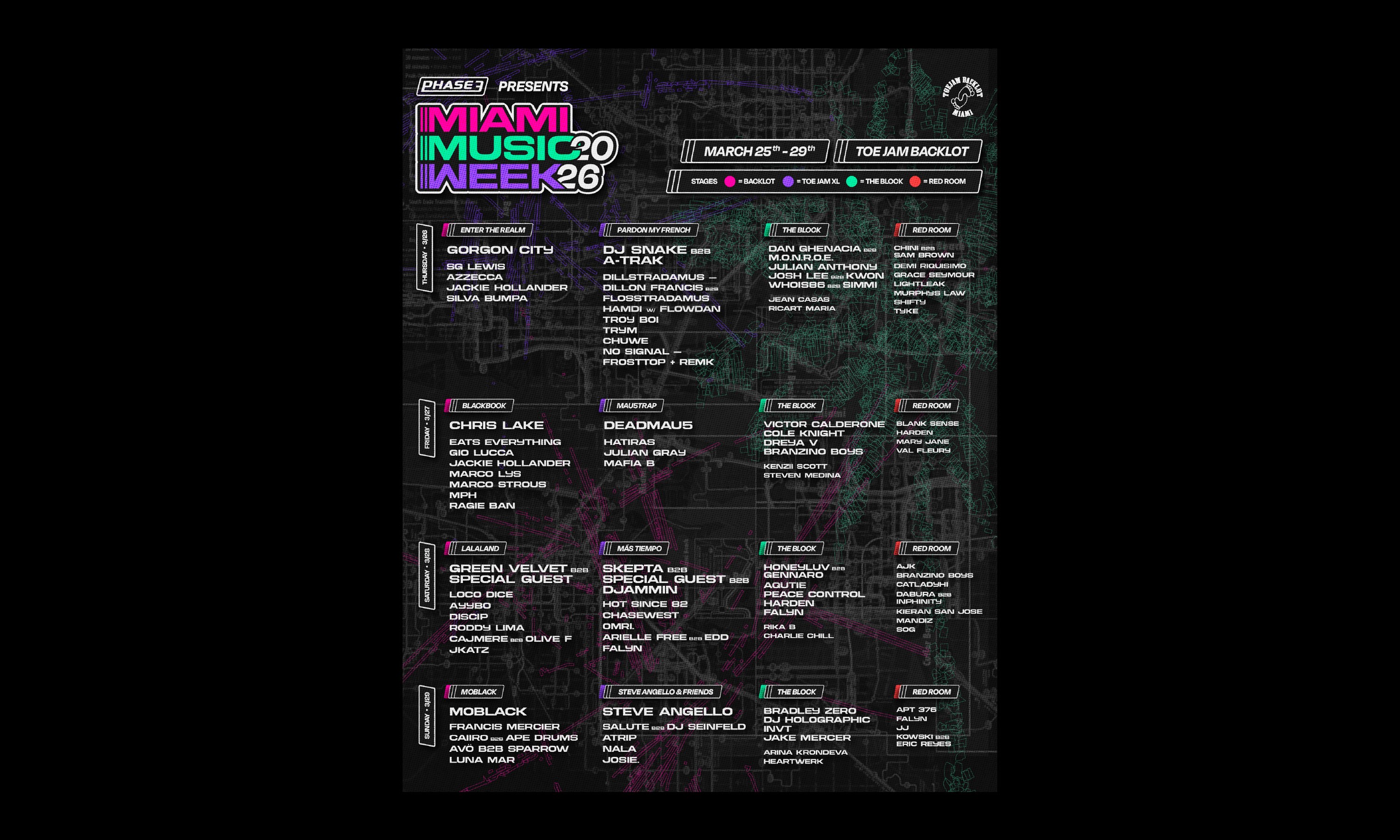
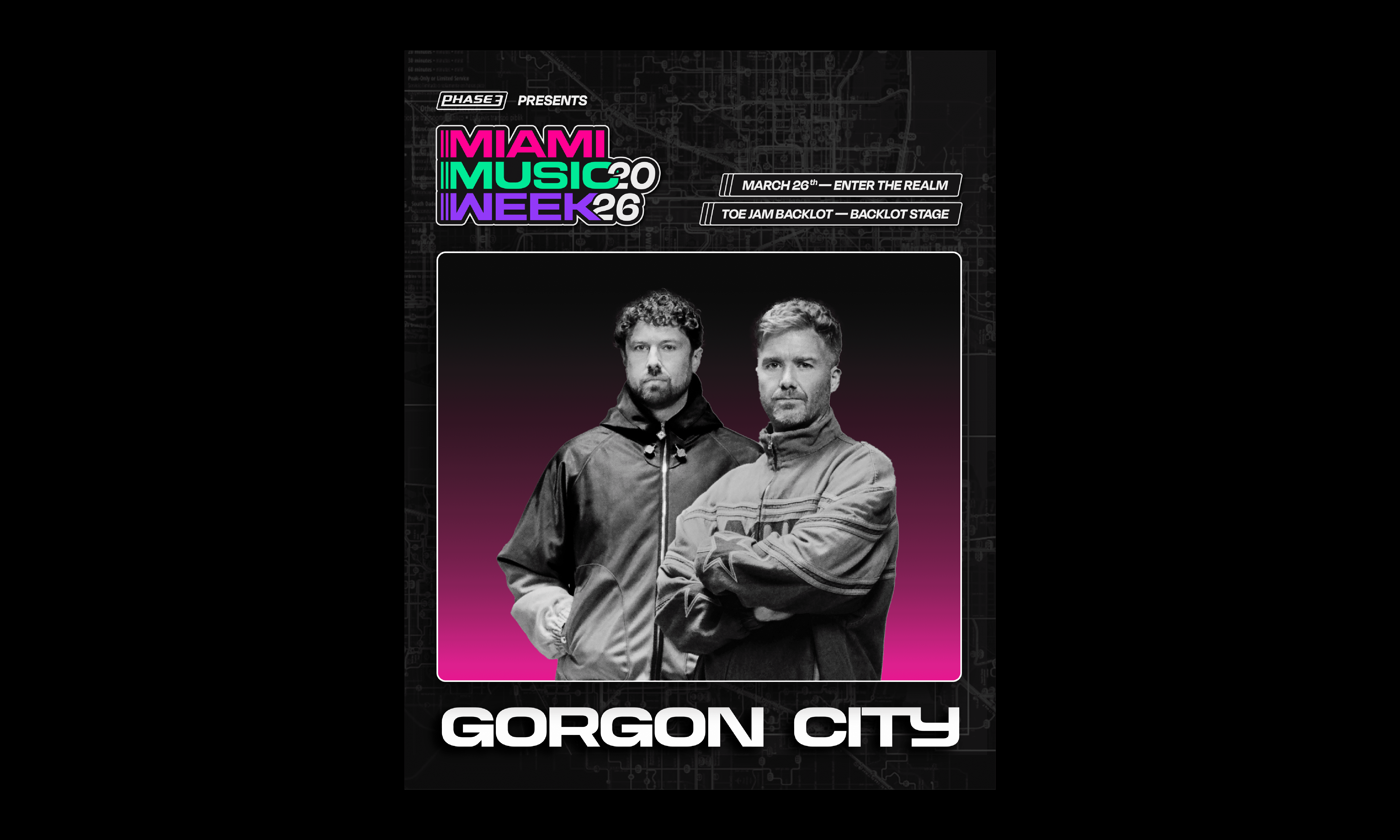
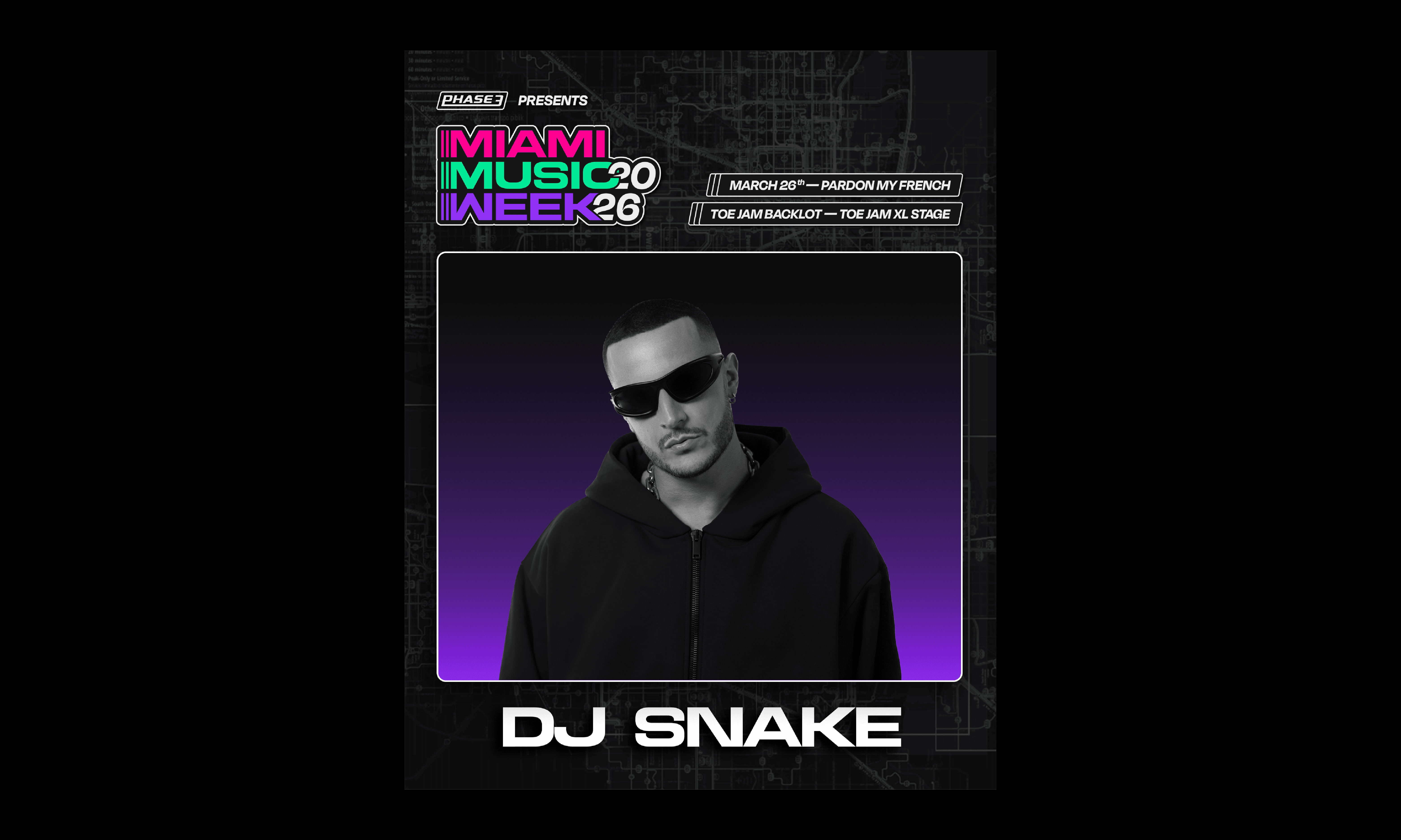
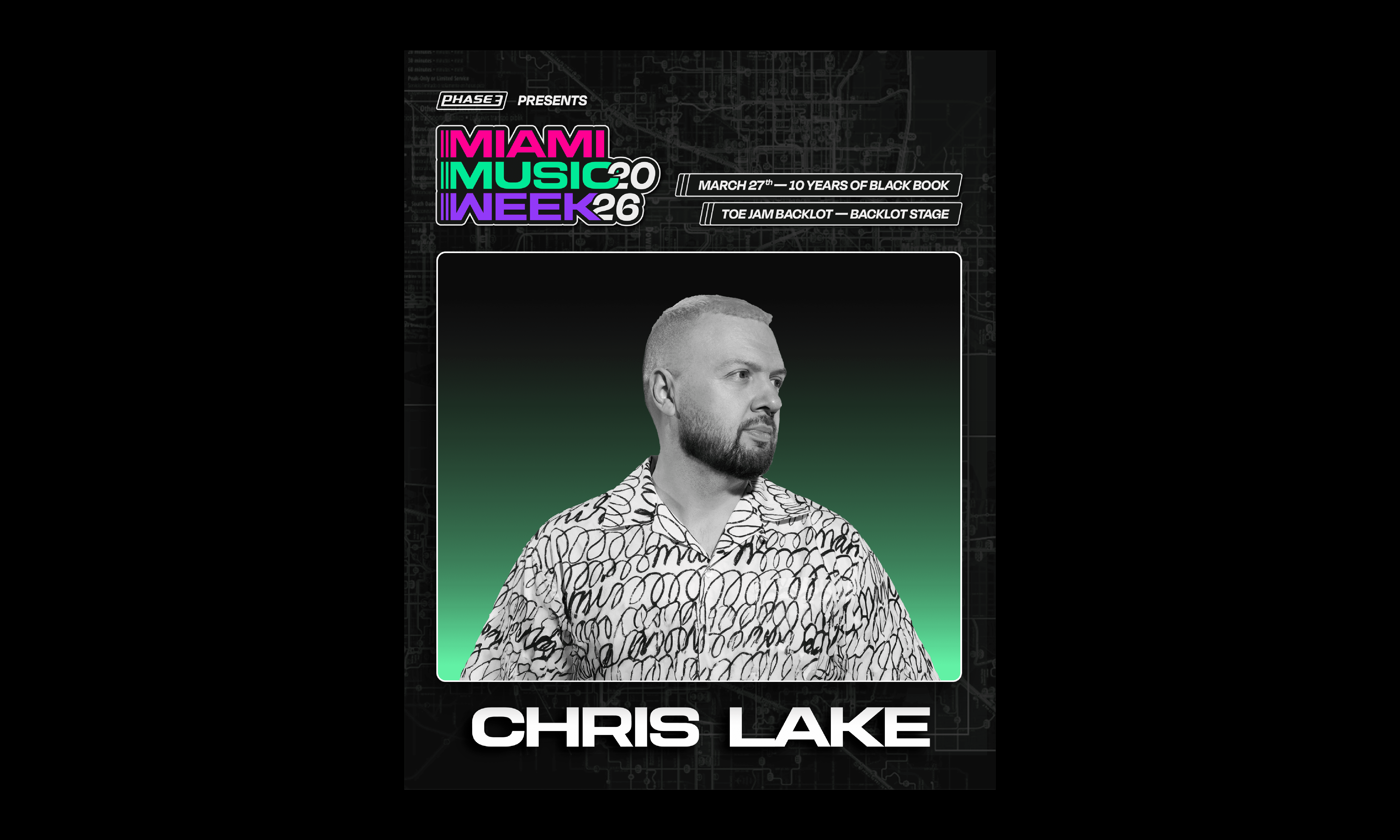
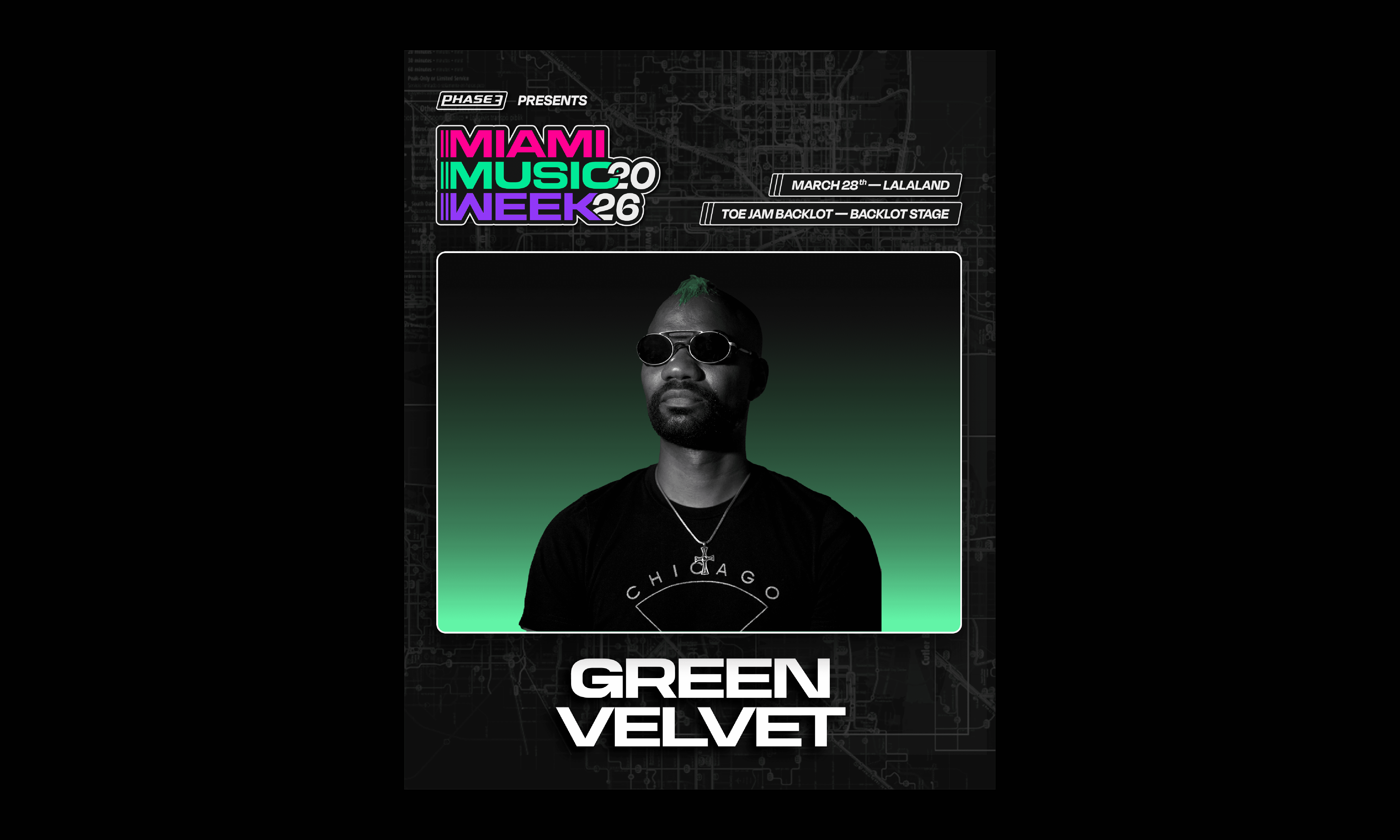
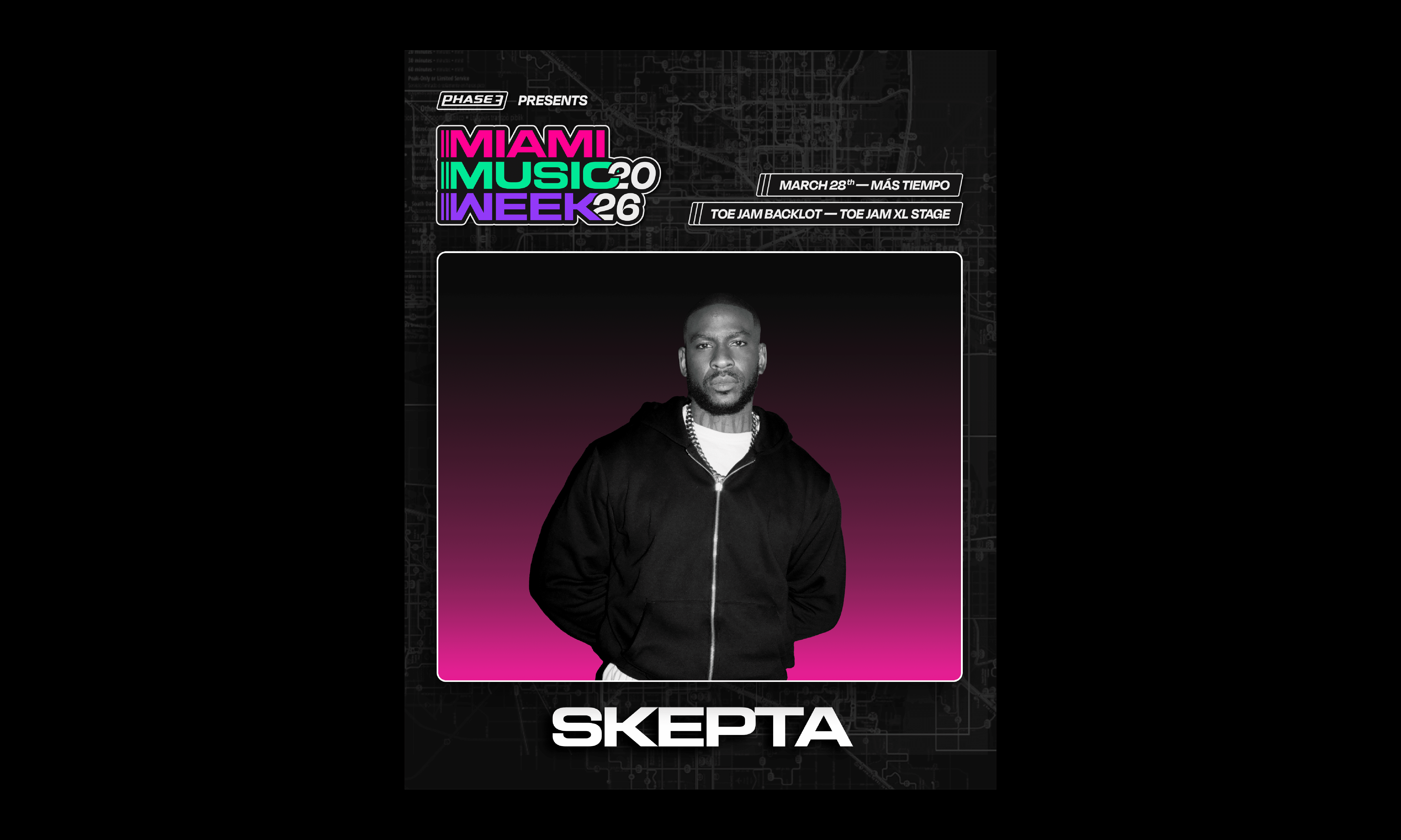
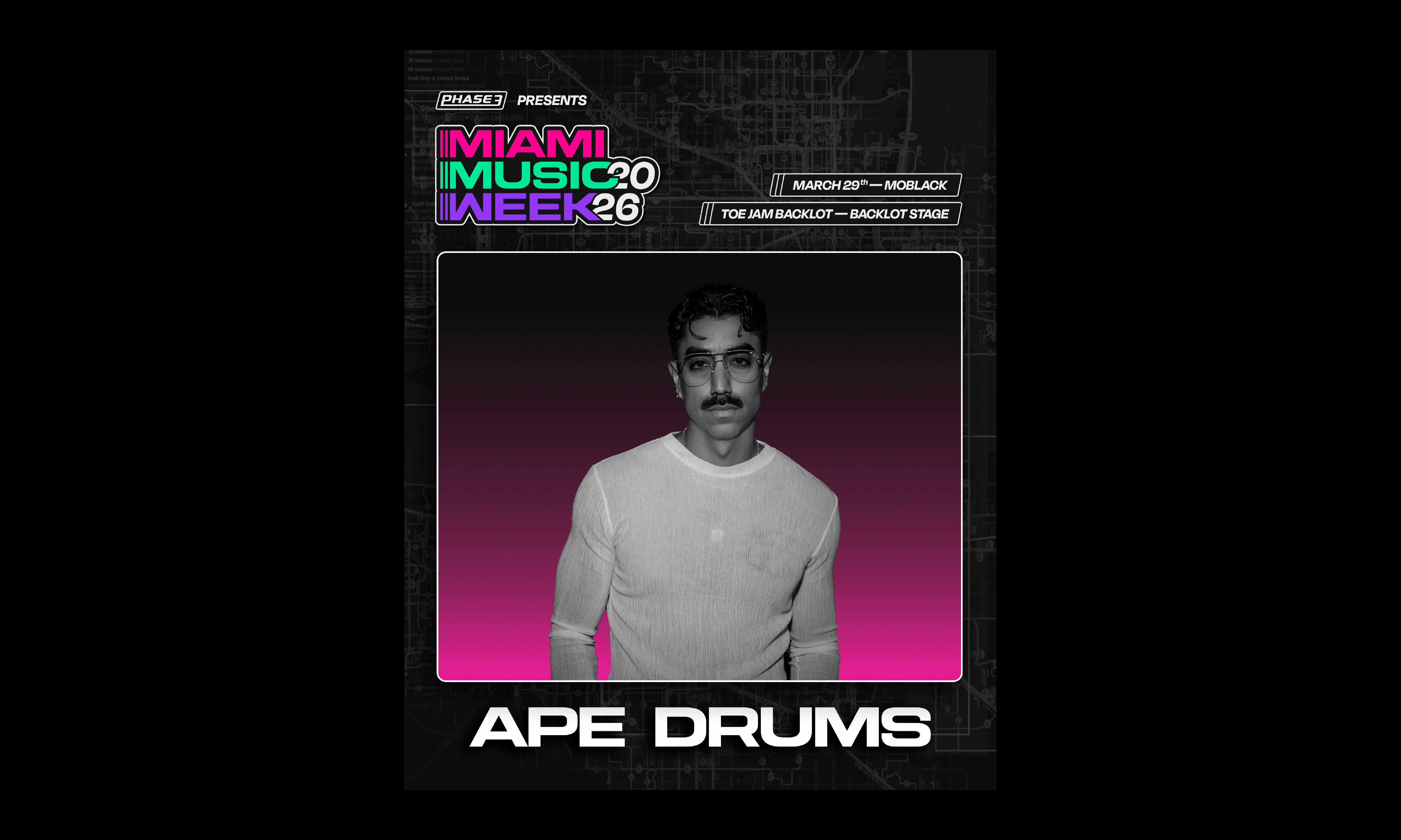
The primary campaign assets introduced the full week of programming while giving key headliners their own promotional moments. The system needed to hold a lot of event information without losing the energy, hierarchy, or visual impact expected from a major Miami Music Week lineup.
visual direction
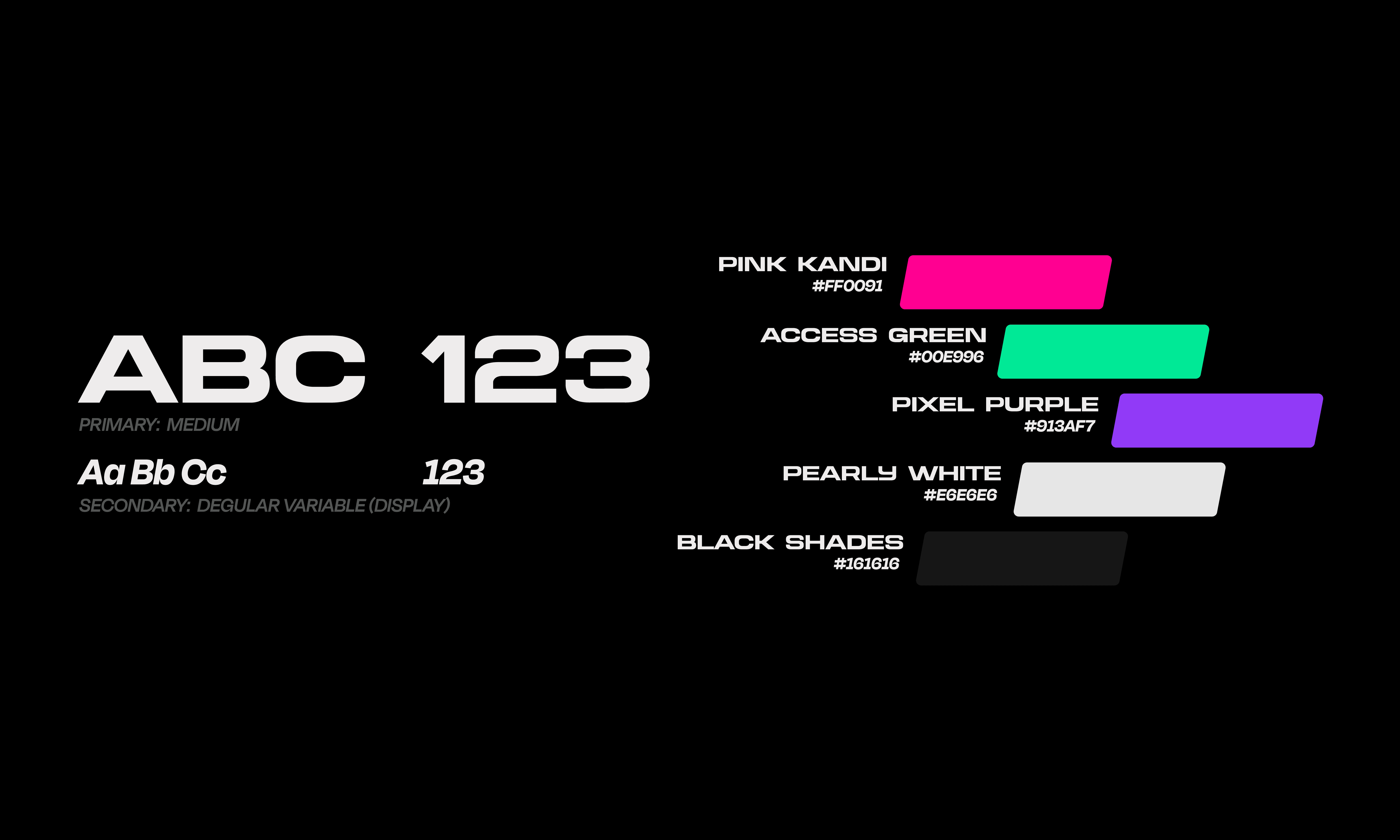
The visual language pulled from Miami’s city culture through color, movement, and atmosphere rather than literal tropical references. A downtown map-based graphic treatment added a sense of direction and arrival, giving the campaign a more futuristic, nightlife-driven edge.


event touchpoints
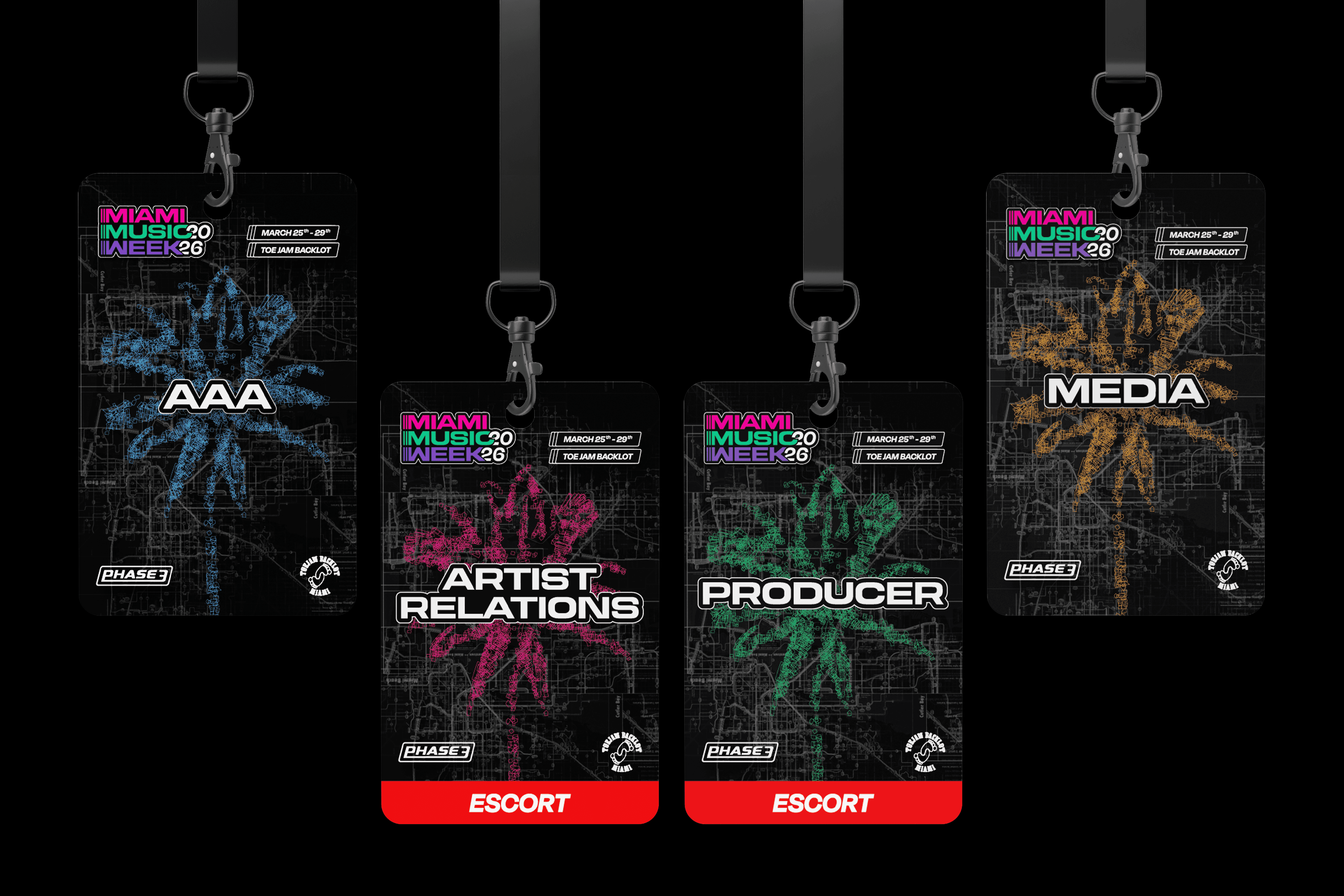
A selected look at how the campaign system extended into physical event materials, including wristbands and credentials for staff, artists, and guests. Each touchpoint needed to feel connected to the larger visual language while staying functional, scannable, and easy to differentiate across event days and access levels.



the live event
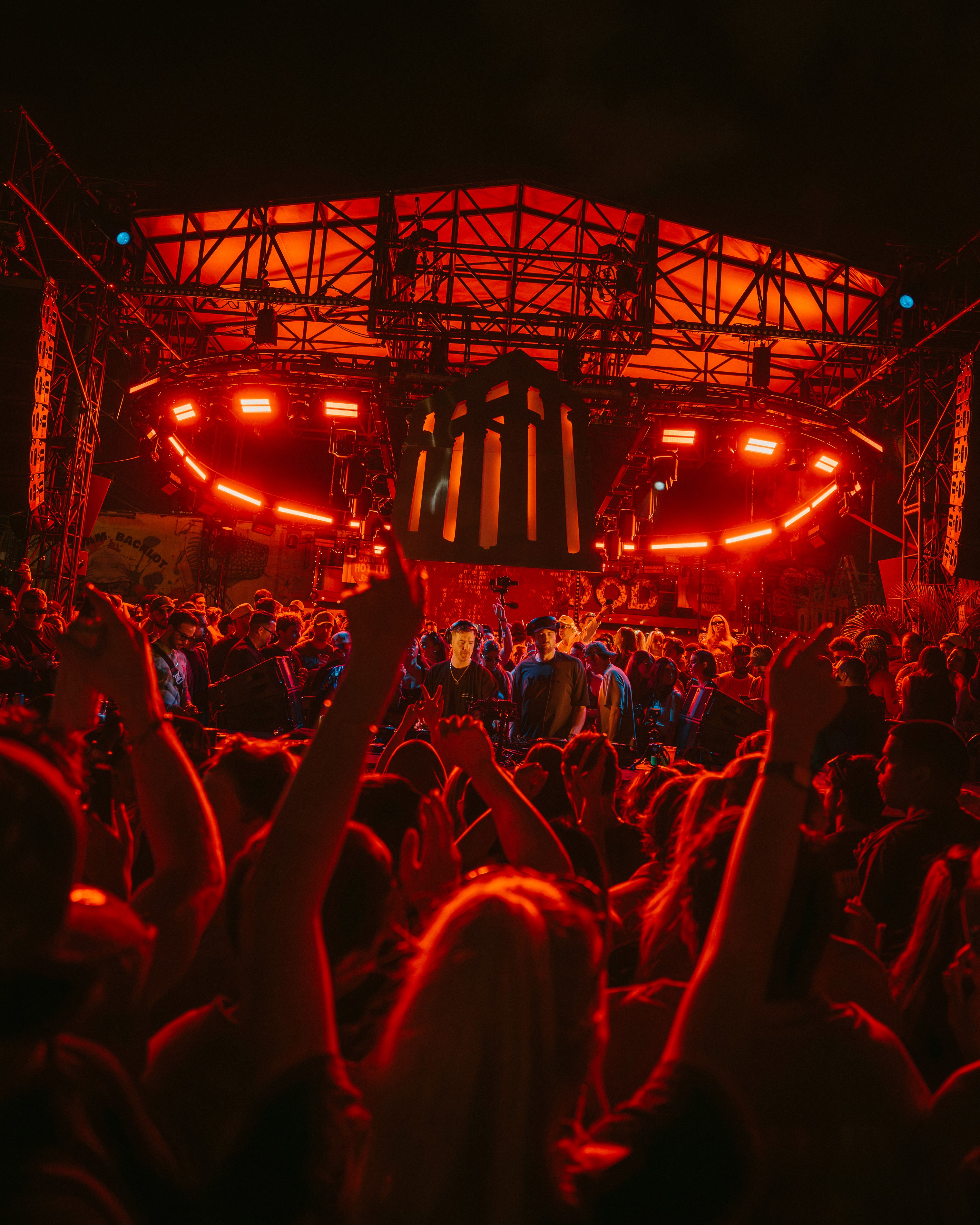
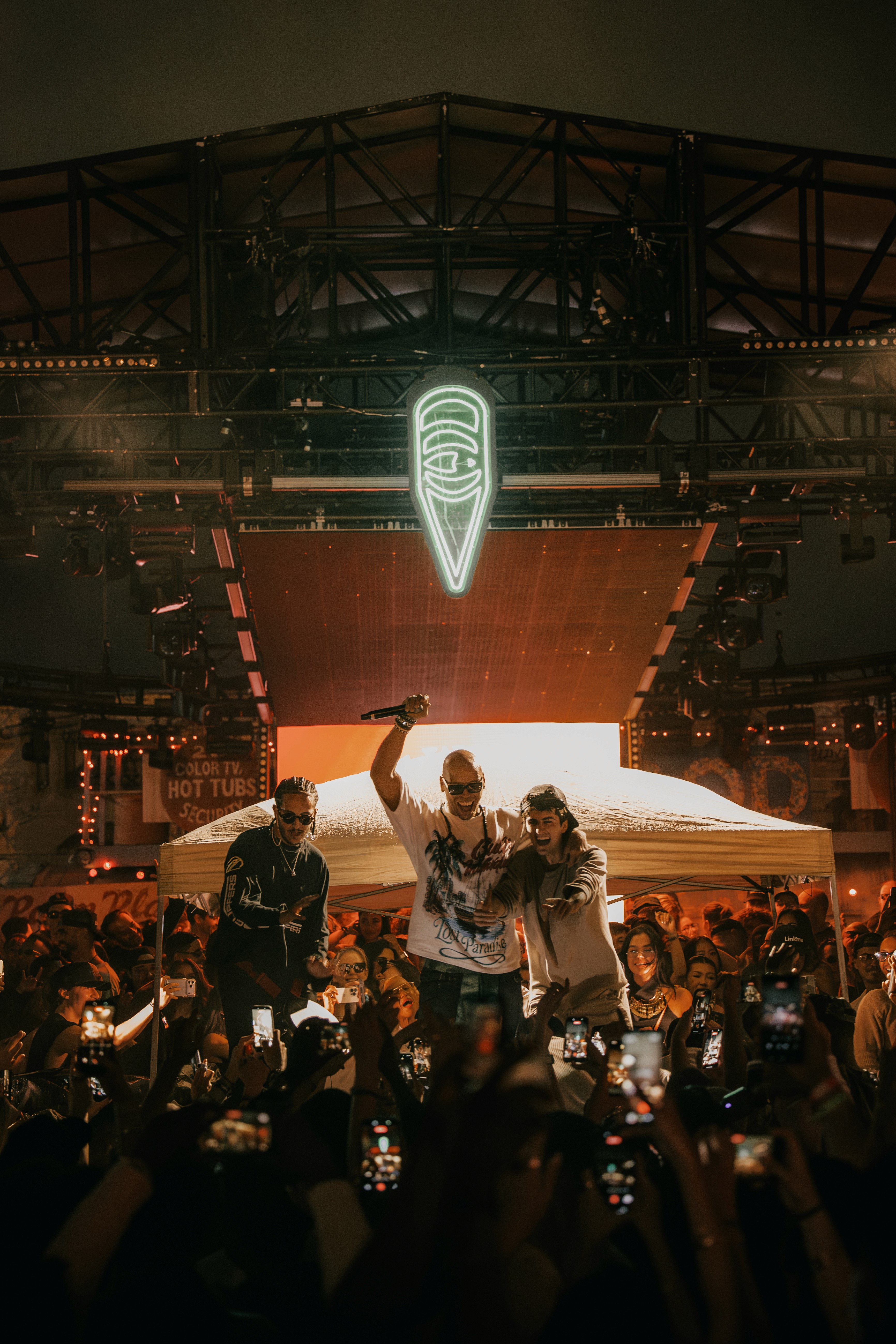
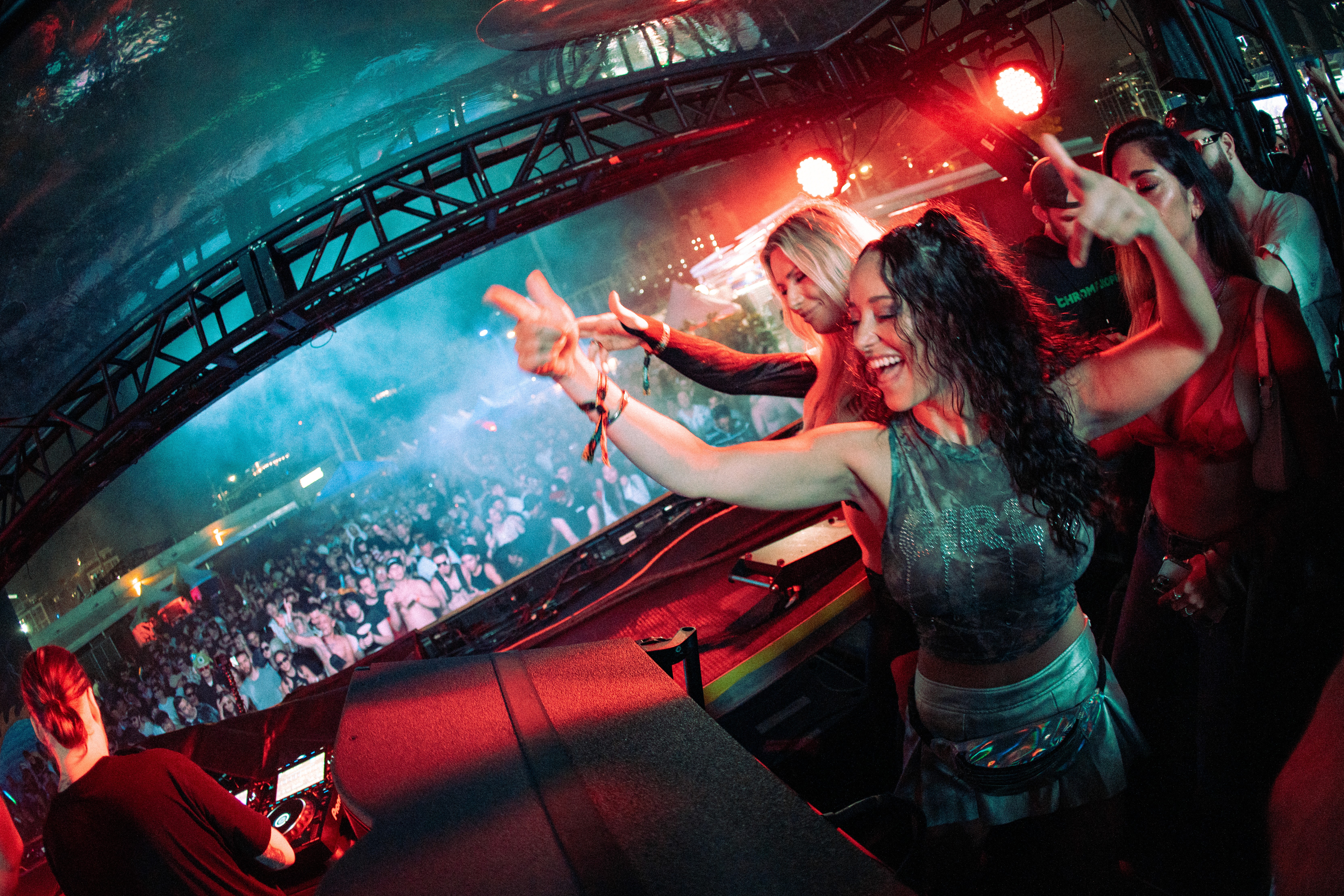
The final campaign lived across both digital promotion and the on-site experience, supporting a week of programming during one of the busiest moments in electronic music. Event photography helped capture the scale, atmosphere, and real-world energy the system was built to support.

visual direction
The visual language pulled from Miami’s city culture through color, movement, and atmosphere rather than literal tropical references. A downtown map-based graphic treatment added a sense of direction and arrival, giving the campaign a more futuristic, nightlife-driven edge.
The visual language pulled from Miami’s city culture through color, movement, and atmosphere rather than literal tropical references. A downtown map-based graphic treatment added a sense of direction and arrival, giving the campaign a more futuristic, nightlife-driven edge.
campaign system
The primary campaign assets introduced the full week of programming while giving key headliners their own promotional moments. The system needed to hold a lot of event information without losing the energy, hierarchy, or visual impact expected from a major Miami Music Week lineup.
The primary campaign assets introduced the full week of programming while giving key headliners their own promotional moments. The system needed to hold a lot of event information without losing the energy, hierarchy, or visual impact expected from a major Miami Music Week lineup.

the live event
The final campaign lived across both digital promotion and the on-site experience, supporting a week of programming during one of the busiest moments in electronic music. Event photography helped capture the scale, atmosphere, and real-world energy the system was built to support.
The final campaign lived across both digital promotion and the on-site experience, supporting a week of programming during one of the busiest moments in electronic music. Event photography helped capture the scale, atmosphere, and real-world energy the system was built to support.
event touchpoints
The system extended into physical event materials, including wristbands and credentials for staff, artists, and guests. Each piece needed to feel connected to the campaign while still being functional, scannable, and easy to differentiate across event days and access levels.
A selected look at how the campaign system extended into physical event materials, including wristbands and credentials for staff, artists, and guests. Each touchpoint needed to feel connected to the larger visual language while staying functional, scannable, and easy to differentiate across event days and access levels.
partnership materials
The campaign language was adapted into sponsorship materials, balancing the energy of the event with a more polished presentation format for brand partners. The deck needed to feel visually connected to the campaign while still supporting clear storytelling, audience insights, and partnership value.
The campaign language was adapted into sponsorship materials, balancing the energy of the event with a more polished presentation format for brand partners. The deck needed to feel visually connected to the campaign while still supporting clear storytelling, audience insights, and partnership value.